Among one of the many exciting changes released by Microsoft last week was TFS 2013 Update 4.
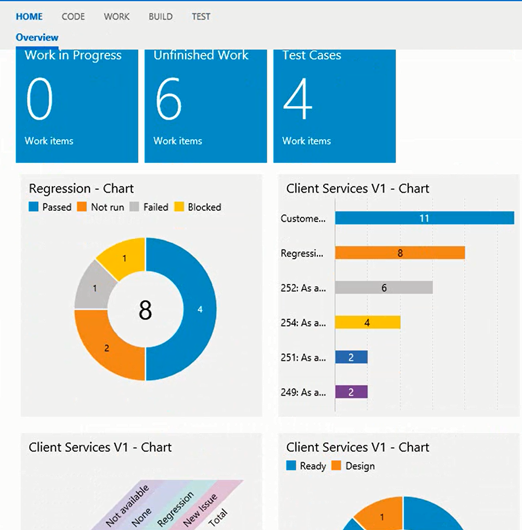
This update includes new lightweight charts that you can access from the Test hub of the TFS Web Portal. The reports provide you with snapshot and trend charts for test cases and test results. Just like other charts, you can pin them to your team’s homepage. These are also available in Visual Studio Online. I cover these charts in my latest Pluralsight course on Microsoft Test Manager 2013.
To access these charts, click on the “Charts” tab of the Test hub: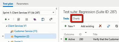
When you get there, and click on “New”, you have two options: “New test case chart” and “New test result chart”: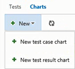
Test Case Charts
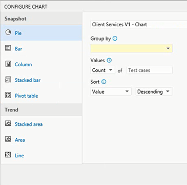
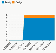
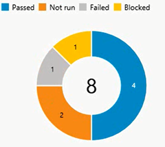
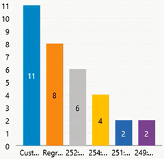
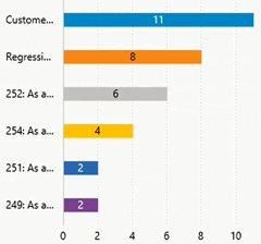
You can get Snapshot charts of the following types: Pie, Bar, Column, Stacked Bar, and Pivot Table. The following Trend Charts are available: Stacked area, Area, Line.
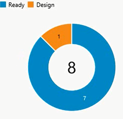
Here are some samples:
Test Result Charts
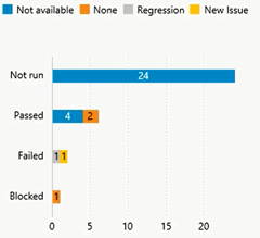
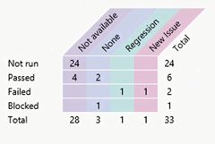
You are able to generate Pie, Bar, Column, Stacked Bar, and Pivot Tables from your test results. 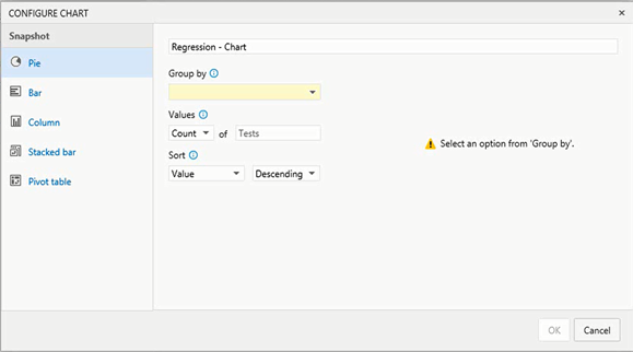
You can group your report several different ways: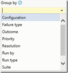
And here are some sample charts: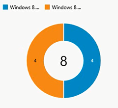
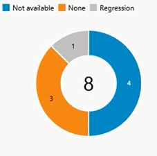
I cover these charts (and a lot more) in my latest Pluralsight course on Microsoft Test Manager 2013.
You can read more about this feature on the MSDN site: http://msdn.microsoft.com/library/dn282443.aspx

